Guide to Monoportal Mapping : Part 3

by | December 20th, 2019 | Tutorials | No Comments »


Conclusion

If you read all the way through this guide and made it to here, congratulations! It certainly makes me happy and humbled that someone took interest in monoportal map-making, as well as take my advice, ideas and suggestions into consideration. I’m very thankful for your readership and interest in what I had to present! Needless to say, this guide is the product of my personal experience with mapping, and reflects my individual thoughts on mapping practices. You may find that you don’t agree with some points in this guide, and that’s not only reasonable, but expected – everyone has different views and opinions on most subjects, and puzzle design is no different.

Read more…
Guide to Monoportal Mapping : Part 2

by | December 19th, 2019 | Tutorials | No Comments »


Autoportal Placement

Something very important that defines most of the style of playthrough, as well as the boundaries of level design, is deciding where – and how – to place the autoportal(s). For this particular topic, I’ll work on the assumption that you used a single autoportal for the sake of simplicity, but you can just as freely expand these ideas upon multiple autoportals. You could even have each autoportal have a different behavior or placement, if you’d like!
Because we cannot easily control where the autoportal goes when we are playing a monoportal puzzle, we have to make moves and plan strategies taking the autoportal’s placement into consideration. As map designers, it is our job to make sure the autoportal is placed in such a way as to provide a good and fun challenge and interesting new interactions and moves, without being obscure, confusing or borderline useless. Here are some ways you can position an autoportal in a map, and how each of them can be used in different circumstances.

Read more…

Guide to Monoportal Mapping : Part 1

by | December 18th, 2019 | Tutorials | 1 Comment »


Overview

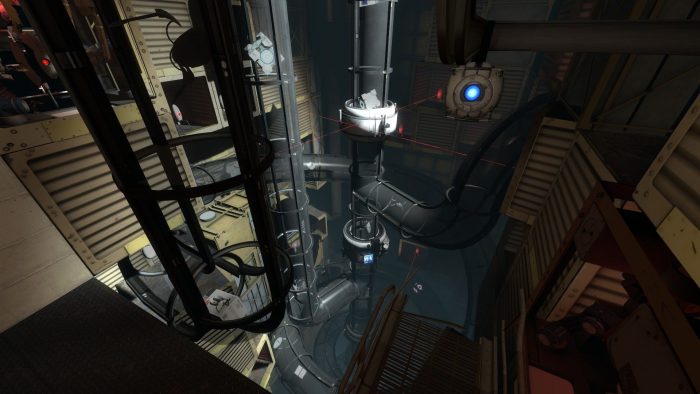
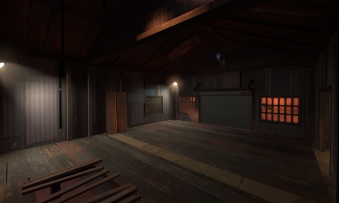
If you’re anything like me, you absolutely love monoportal puzzles – puzzles where you only control a single portal. However, making maps for such a mechanic is not as straightforward as one might think. With this guide, we’ll get one step closer to making better monoportal maps, taking full advantage of their quirks and features, whilst also discussing some of the best – and worst – mapping techniques for such puzzles.
 

Read more…

Making A Portal 2 Vactube Ride

by | December 17th, 2019 | Tutorials | No Comments »

Did you ever wonder how Valve did their awesome vactube ride sequence? The answer is with a custom animated model. But did you know that you can do it by yourself without any model? It is actually pretty easy. Let me tell you how.

Read more…

Sorting winners from losers

by | February 27th, 2012 | Tutorials | 2 Comments »

In my TF2 king of the hill map koth_skylab, I wanted an ending sequence that would use a trigger to set the losing team on fire.

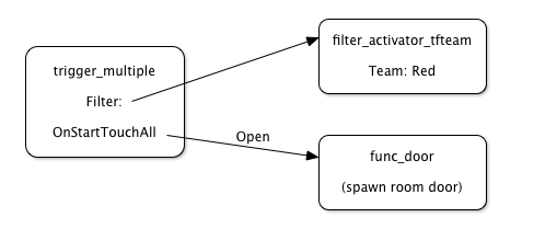
The usual way of distinguishing between teams in a trigger is to use a filter_activator_tfteam. It has a Team property which can be set to the red team or blue team. Spawn room doors are a typical use of this filter, to allow only Red players into the Red spawn room, and only Blue players into the Blu spawn room.

Opening a spawn room door

Read more…

Increasing bounce lighting with $reflectivity

by | February 14th, 2011 | Articles | 33 Comments »

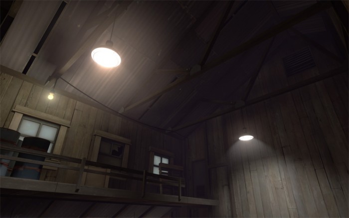
So you’re putting in lights and you find the perfect settings to light the room, but there’s a problem: the ceiling is almost pitch black! A surprisingly common problem, so what do you do? increase the light’s brightness and suffer a blinding floor? Nope.

Default reflectivity values, the ceiling is way too dark but the ground is a nice brightness.

All too common, the light level in the room is enough to illuminate the floor and lower walls but the ceiling is far too dark, all the effort you put into detailing it is going to waste!

Just edit the $reflectivity value in the .vmt for your floor material.

Read more…

Sun Spread Angles

by | January 11th, 2011 | Articles | 6 Comments »

Just a quick one today to clear up something that possibly isn’t experimented with much when considering lighting, the spread angle from the light_environment. The entity itself recommends a value of 5 degrees to start with however, as my attention was drawn recently to, this is actually quite a large angle. You’ll see on a sunny day, the shadow from a tall building is incredibly crisp. The angular size of the sun, a non-point light source, is about 32 arcminutes in the sky, which is just over half a degree. So picking a sun spread angle smaller than 5 degrees is a good idea if there is little to no cloud cover in your skybox.

The images after the jump are examples of sun spread angles 0, 1, 3, 5, 10 and 20 degrees.

Read more…

In Defense of Turbine

by | December 27th, 2010 | Articles | 3 Comments »

Turbine

To the Team Fortress 2 mapping community, Turbine has become an icon of hatred. Everything mappers don’t like about Valve’s selection of maps, summarized in one single BSP file. It’s “too simple”. It isn’t “well-detailed”. The complaints against it are numerous. This is unfortunate, because Turbine is a map that should be carefully looked at and analyzed. It’s obviously a successful map, Valve picked it up because of its popularity. And what makes it a popular map? That is what I’d like to dive into.

Read more…

Lighting Compile Options

by | December 2nd, 2010 | Tutorials | 10 Comments »

Today I’m going to discuss the lighting conventions of source. Source has been evolving steadily since Half Life 2, with the introduction of HDR with Episode 1 and then per-vertex lighting for static props and shadowing textures with the Orange Box. These new methods for calculating lighting at compile time have become the standard for source, everything produced since the Orange Box uses them.

Unfortunately the improved lighting introduced with the Orange Box was not added to hammer’s default compile settings, even as options, so we must add them ourselves. That means we need to know what they are and what they do. There are three options that we’re going to look at today, texture shadows, per vertex lighting for static props, and exact outline shadow casting for static props. So what exactly do they do?

Read more…

A look at the detail of TF2 Part 5: Viaduct

by | September 29th, 2010 | Articles | 2 Comments »

It came up when people were asking and it’s a map I admire myself so koth_viaduct is the subject of my final part of this series.  The best way to end a re-run is with something entirely new too, so with that in mind let’s press on and see what Viaduct has to offer.

Straight after spawning I take a look around and instantly see two awesome things:

Read more…