It came up when people were asking and it’s a map I admire myself so koth_viaduct is the subject of my final part of this series. The best way to end a re-run is with something entirely new too, so with that in mind let’s press on and see what Viaduct has to offer.
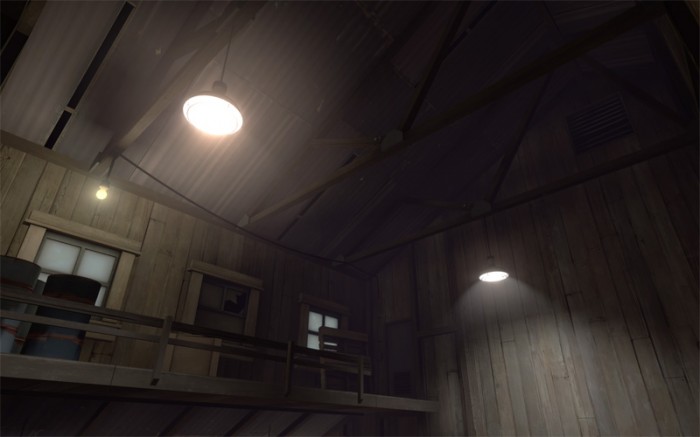
Straight after spawning I take a look around and instantly see two awesome things: an asymmetrical roof with some awesome support work going on, and a light switch that visibly leads directly to its light. I apologise if its hard to see on your screen, there is a strong fog in viaduct and not much light up there.
There is always the temptation to just clip your rooftops to a symmetrical angle instead of taking the more creative route of having one side shallow and one side steep. I stayed in the Alps last summer and I was surprised by the number of buildings which had this kind of roof. It also lends itself well to the neat supports here, don’t forget to consider adding the metal plates on the joins. The light that’s casting a nice shadow on the ceiling is just a 90 brightness point light entity and a little cylinder of blocklight just above it.
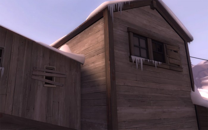
This shot shows boarded up windows, often windows are just sunk slightly into a brush textured with wood\wood_beam03 and left as just that but since the alpine theme came along there are 6 patch models, each with three skins. They’re great for boarding up windows and doors, I’m pretty sure the _small variants of the patches were sized specifically to board up the sawmill_window’s seen on the right hand side here. The image below shows another boarded up window that uses wood\wood_wall001 instead of wood_beam03. What I’m trying to say here is try using other methods to board stuff up, I know I certainly use wood_beam03 too much.
There is also a wooden support running all the way around the bottom of the roof, I don’t often do this but it’s quite common in the real world so there isn’t really any good reason for me not to. It does also create a nice contrast between the dark wood and light icicles, making them more visible.
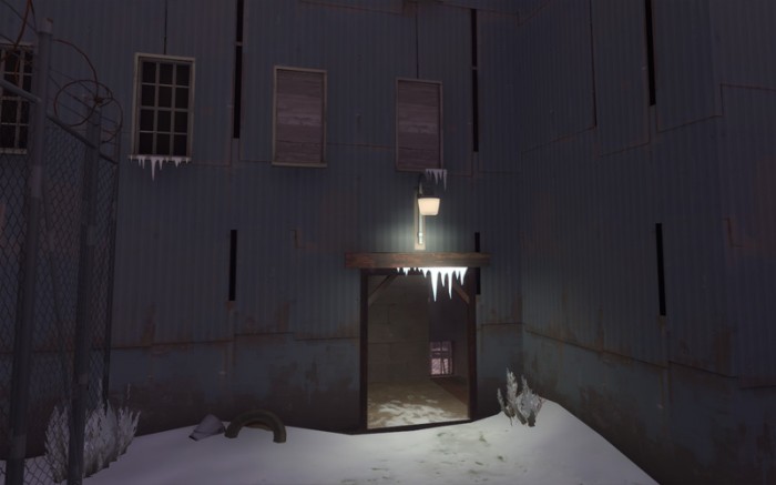
Apart from the previously mentioned boarded up windows, there’s an extra wooden lintel brush above the standard doorframe model, a fast and easy way to make any, otherwise boring, doorway more interesting. Snow is also like the sand I pointed out in badlands, you can sink props like tyres into it without worry, just make sure that you don’t on any firm grassy ground for non-desert, non-snow maps.
I’d also like to point out here the repeating black strips present in so many of the metal wall textures, I hate these and always try to hide them whenever possible. Not because I don’t like the way they look, but because of how regular and precise the repetition is, especially on large walls. Any wall over 512 units wide must have at least two of them showing and the repetition is even worse if tiled vertically which many large industrial buildings need to be. To counter this I sometimes start the first 256 units off as a brick texture which you can see through the door is what Valve have done on the other side, and I like to add smaller extensions when any single face gets over around 768 units wide. Since the new section of building is small, the texture can be carefully aligned to show as few black strips as possible. Then I use doors, windows vents and supports to hide any remaining strips as best I can. I try not to hide them all, but aim to break the regularity in their pattern.
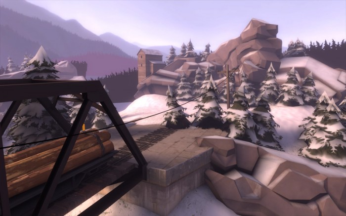
So where did that train come from? When detailing high areas like this, remember that the player can’t see the ground, which really knocks perspective, until I opened Viaduct up in hammer I’d always looked at these trees and assumed they were much closer and not anywhere near the tacks. As long as it’s not easy for a player to see that it’s wrong, it doesn’t really matter, hence the lack of anywhere for the train to go even if the tree wasn’t there.
Telegraph poles run either side of the viaduct and a single cable runs along its side. Viaduct has three telegraph pole networks in total, one running across the central viaduct, and one coming in towards each spawn building. They’re really essential in any map, whether they’re carrying power or phone lines, almost every building needs electricity so if you haven’t got any in your map, you should turn off all the lights.
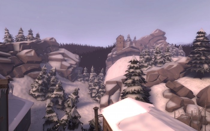
Way off buildings like this are great, often it seems weird that all of the buildings are concentrated in the centre a seemingly arbitrary space and adding some in the distance helps sell the map being part of a larger industrial environment. For buildings do far away only the bare minimum is needed, those windows and door you can see are just toolsblack textured brushes. The roof also has a dark wood border around it so you can see it clearly. As it’s exactly the same size and shape as the out-of-bounds buildings on the other side of the map as well as very nicely off-grid, it was probably a func_instance that was collapsed to have it’s detail removed. Instances are great for off-grid rotation because in the instance .vmf all your work is on the grid at 90 degrees, then you rotate the func_instance and everything rotates properly.
I don’t have anything insightful to say about the rolling hills, rocky cliffs or clumpy trees, just that it looks great. Viaduct has one of the simplest 3D skyboxes, just a smattering of tree cards arranged to give the illusion of dense forrest.
That’s it folks.
Tags: blocklight, detailing, Team Fortress 2, tf2, Viaduct
Hey, good job! I always loved the feeling of both viaduct and stark. I also really like those buildings in the background too. I think offblast had like 10 or something, and I remember one of them had his initials in it. 🙂
Also, just a random question, but in a map would it be okay to have a ‘secret room’. Nothing special, just concept art of the map.
-Egan
latest fast food menu prices
A look at the detail of TF2 Part 5: Viaduct | Nodraw.net