Here is the second part in the series. I was looking to Goldrush a lot whilst making Hoodoo, it was the first official map I spent any length of time actually studying so a lot of the techniques I use are similar. You’re gunna get a pretty picture before the read more tag this time, aren’t you lucky? Well, not really.
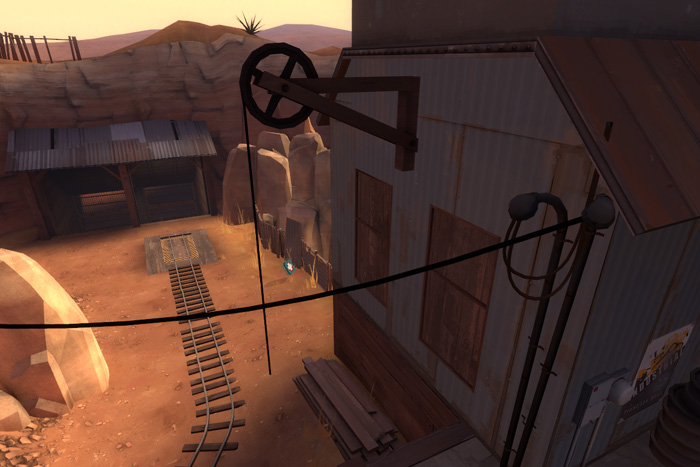
What’s the focus of this picture? Wires. In my time testing maps I’ve seen a lot that have little or no use of wires, and on the flipside I’ve seen maps that have wires here, there and everywhere. The way official maps employ wires is probably closer to the latter, but they don’t go completely over the top. Wires between telegraph poles, from crane wheels, between building roofs, these are all common spots for wires in the real world and should be in your maps too, they’re something that’s very quick to add to your and easy too. The power a simple wire has to make your map look better is amazing; if you’ve not used wires before try them out. Bung in a move_rope, set it some slack (usually between 90 and 120 looks good) and then give it a keyframerope to connect to. Often the width of the wire is fine at the default value but don’t be afraid to vary it a little. If you’re really feeling daring you could change the material it uses to try a different colour or perhaps rope. I’m not sure if there are any non-default wires in official TF2 though, but when did that ever stop anyone?
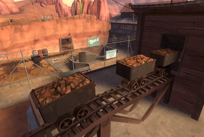
Got any mine carts in your map? Instead of leaving them empty, put a small displacement in it with a gravel or even gold texture, this is a dead simple way to make each one look different from the last. Plus, you get the added bonus of it looks like someone actually worked in your map; a map full of completely empty mine carts will just feel weird. Of course you can vary the scale of the texture to make it look like it has bigger or smaller rocks in it. If you’re going to place several next to each other like this shot, make the first displacement then turn texture lock off before you copy it. That way the rocks on the displacement look different for each cart even if the displacement is the same shape. This wasn’t done in this shot and you can see that all three mine carts have the same pattern of rock in them. It doesn’t just stop at mine carts, you can add displacement mounds of dirt/rocks/gold anywhere, like at the end of those tracks in the background of this shot.
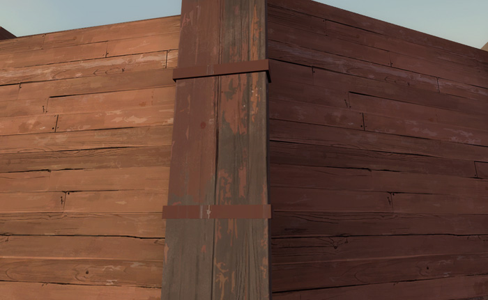
Nice bands holding the wall’s support beams together. Taken from close up.
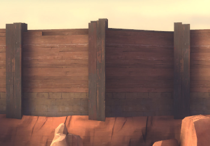
This is the same wall but seen from the opposite side of the playing area then zoomed in. The small bands in the previous shot haven’t just shrunk to a size too small to see, they’ve actually disappeared. This is normally a trait associated with models, when they get far enough away they fade out and your PC doesn’t render them any more, actually this can be done by brushes, and even overlays. It’s a really great way of cutting the amount of stuff your PC has to render, you pick small brushes that you can’t really see from a distance and you make them a func_lod instead of func_detail. That way you have complete control over how far away they should fade out and of course once they’ve faded out they are no longer drawn and aren’t a burden on your system. A good little trick for areas that have a few to many details for good FPS.
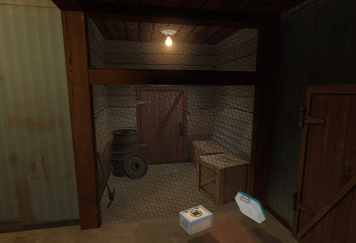
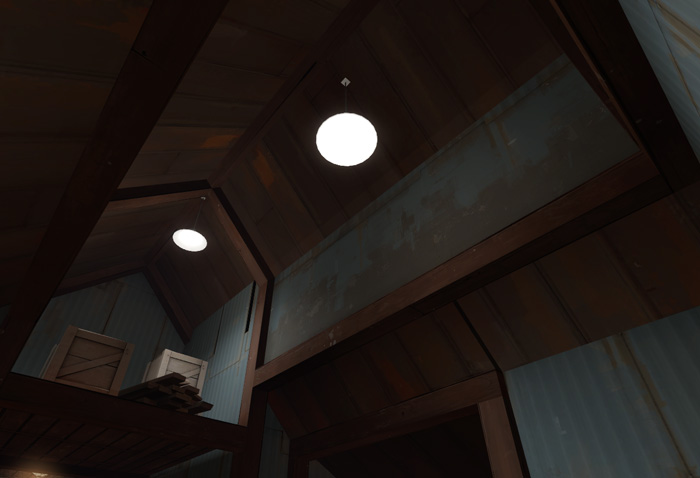
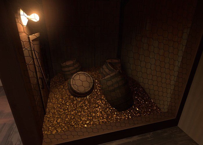
Each of these areas that are completely sectioned off from the playing area really help to enlarge spaces. Keep them reasonably small and light them well and they’ll really help convince the player he’s in a bigger environment. Inaccessible balconies are great for this too, as long as the ceiling is high enough, adding a small balcony with a door either side easily improves a bare room. In the bottom shot there’s another displacement pile of gold, just like the mine carts. Oh yeah, don’t for get to add some glow to those lights, env_sprite, point_spotlight or env_lightglow all work well.
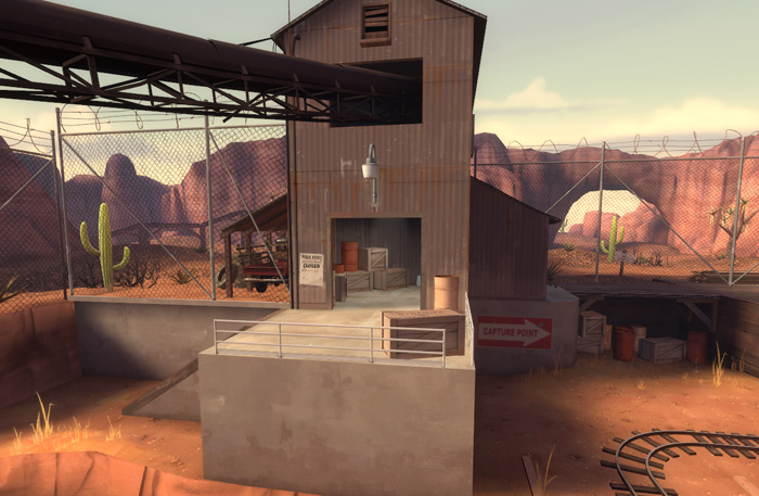
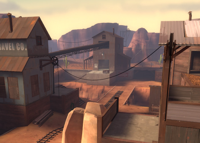
This shows same building viewed from upclose and from the other side of the area. How many props can you see in the first that aren’t in the second? I make it about 26ish (probably more than that though) which means from the far side of the space you can see this building from it still looks much the same but you’re rendering about 6 or 7 thousand less polys than if those models hadn’t faded. The way this is achieved is from the fade distances set in the model’s properties. This is a feature vastly underused in custom maps, many have no fades set at all and in Official maps around 80% of props have a fade distance. Naturally some props are just too big or can be seen too far for a fade distance but the vast majority of props are better with one set.
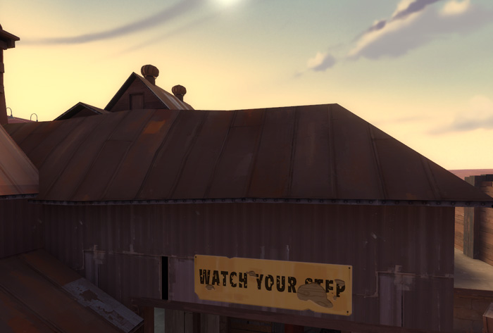
Ahh yes, the displacement roof, great for abandoned or just aged facilities, not a technique to abuse for any freshly built kind of environment though. Make some of your roofs into displacements, power 2 is enough – then warp them slightly like this one. You can only really see the effect when you’re still but when you’re playing its a small thing that really helps make seeing roof after roof after roof less monotonous. Because displacements are done as a batch process this isn’t as intensive as you might think, whilst I can’t give any really figures on if its better or not it really isn’t the sort of thing you need to worry about when optimising. Displacements are also not cut by the tools/skybox texture so you can safely divide an area across a displacement roof and know that the whole displacement will be visible on both sides of the skybox brush, great for tall buildings.
More coming soon.
Tags: detailing, displacements, Goldrush, Lights, Mapping, optimization, Team Fortress 2, tf2
I think you should point out that the fade distances are quite important not to make to blatant. There are a few places where the props start appearing while your running along a long corridor with nothing else to see. Be sure to use the fades, but also dont place them where people will almost always see them.
Anyways, good tutorials! Keep them coming!
1/8 & 9 images shows rly professional and great detailing but the 5 & 7 images is rly makes no sence with that fence, just no logic back there. [somethimes maps makes lol ^^]. & now that FADE DISTANCE in one hand is great thing because everything in long distance looks like abstract graphic images and thats cool for games like Team Fortress 2 or Battlefield Heroes but is not a feature and its still not perfect, but its serious shit ^^. I like it, but in some cases its so stupid, anyways great post 🙂
Hey, It’s Cap from the forums. Rereading this tutorial was nice, and I have a couple of notes to make:
“Nonstandard” ropes are used in TF2. There’s a rope with the rope texture in 2fort, on the RED side. It’s on a crane in the “grate room”. I can’t thi9nk of any other examples, but there’s probably another crane that uses the ropes
Also, in the last picture, the building has the “watch your step” sign with a wood background placed on a metal surface. Therefore, the building is either made of wood and painted to look like corrugated metal, or an error has been made :P.
I think that sign is a wooden sign nailed to a metal wall, see how it’s got nails in the corners, if it was just a painted sign it wouldn’t have those.
@i74s Fade distances can be used more harshly in such stylised games, in more realistic games you’d leave longer distances, target smaller props first and rely more on LoD models cutting down the number of polys without removing the prop itself.
Very cool stuff!