I’m going to be moving all of my articles from TF2maps.net over to Nodraw in the next few weeks. I’ll keep most of the original information but I’ll be updating a lot of it. Starting off with Badlands, I’ll take a look at how Valve have used various techniques to detail their maps.
Once more into the breach, dear friends
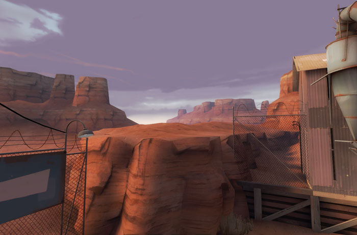
This first shot shows off the 3D skybox being used, notice how as the mountains get further into the distance they become more and more blue? The fog colour that has been used matches the rough colour at the base of the 2D skybox behind it. This holds true for any map, in any game. The fog colour you pick should be roughly the same as the colour of the skybox texture near the horizon. Think about it, when it’s foggy, what colour does everything get as its further away? What colour is the sky, at the horizon? If you answered both those with the same colour then you are correct and understand the principle. Pat yourself on the back.
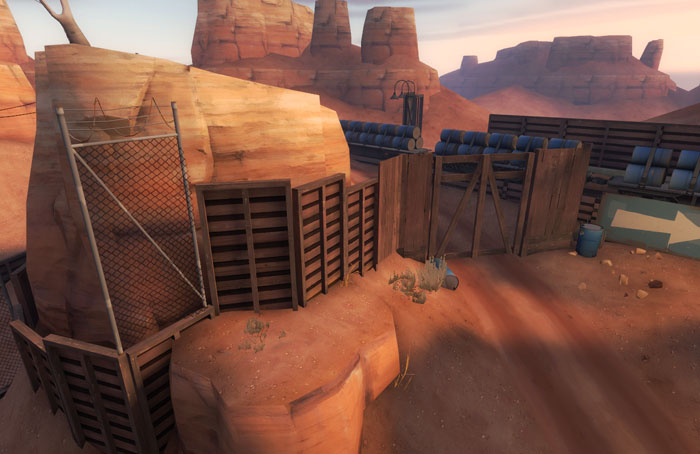
Here, some simple ways you can block players from leaving the play area. Whilst it is clear that a demoman or soldier could jump over those fences they can’t. And nobody questions it. On Hydro there is a fence that is only knee high and nobody questions it. All that is needed is a visual barrier that divides the playing area (visually interesting) from the out-of-bounds area. The out-of-bounds area is usually quite bland but generally it has just enough key details in it to stop it looking out of place, for example that dirt track, keeps going on through those gates, as does the train and track. That billboard in the background as well. Little things like this keep continuity even though there is an immediate fall off to visually sparse.
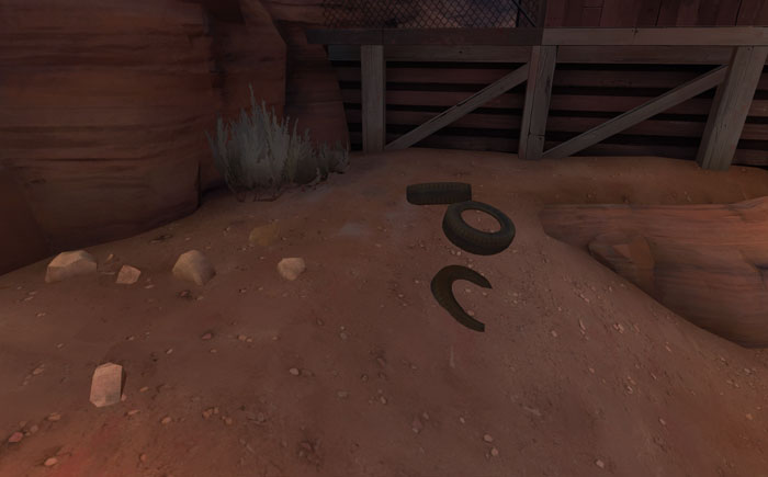
Some simple details here. A few tires sunk into the ground along with some foliage, rocks and an overlay on the ground under the plant as well. Most of the ground in Badlands is pretty free from props and they tend to be clumped like these. The tyres can acceptably be sunk into the ground in this near-abandoned desert environment, you wouldn’t want to sink tyres into grass on an alpine map though, soil tends to be a lot firmer than sand. The player will hardly notice these because they don’t have to worry about them. They can run straight over them and are never going to get snagged on them whilst running backwards away from an enemy. It’s always important when putting low props on the ground to make sure that players can run over and around them easily without even thinking about it.
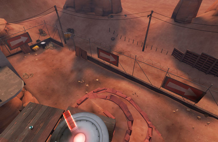
This perfectly illustrates how you should never be afraid to tell the player where to go. You would think that three massive signs all pointing the same way would be too many, but no, it works just fine and players hardly even notice them. Whilst a player is busy taking in lush environments/killing waves of enemies/fleeing from waves of enemies, their subconscious will see the signs and gently push them in the right direction without them really being aware of it.This shot also shows a bit more of how small details are continued in the out-of-bounds areas. And although this area is only blocked off by chainlink fences, don’t be tempted to only use chainlink fences in your map. Don’t forget to vary things a little.
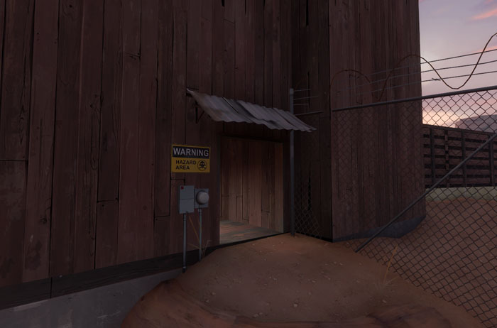
Finally (for now) this image shows where detail is needed. Detail is needed most wherever the player is. That means around doors, around windows they might shoot from, any room with intel/CPs in, spawn rooms… You want to be putting details like junction boxes, clocks, signs, boxes etc where the player will be most often and props clumped around doors are a great example of this.
That’s all for now. Look out for the others coming soon.
Tags: detailing, Mapping, Team Fortress 2, tf2
I swear I’ve read this before..
This goes pretty well with the “Density of Detailing” article that went up a few days ago. Oddly, on my map, some players questioned why they couldn’t hop my waist-high fence and why they couldn’t go over to a spot I didn’t want them to go. Then again, the fence model was the smallest available, so I guess it wasn’t the right model for the job.
In most cases the small fence is supplemented by a small cliff either up or down followed by a remarkably bare area right behind it. Where there isn’t a change in height often a taller fence is needed.
Not sure about the tires, if that fence is the limit of the playable area, they’re placed wrongly imo. They shouldn’t be pointing towards a visible limit, but the playable area, path, or “non confusion non accessible area”, i.e wall. If not, it may make player believe that area is playable and accesible.